
Color
The visual system
The retina of the eye has two kinds of receptors
- rods: black and white vision in low light. Little role in the preception of colors.
- cones: color vision in normal light. Concentrated around the visual axis.

The visual system


Images from Ware (2008)
How does this impact our work?


This effect is due to the low sensitivity of cones to blue wavelengths
How does this impact our work?


Yellow wavelengths excite two different types of cones, making it almost as light as pure white.
Opponent process theory
The brain combines signals from different cones to build three channels:
- Red-Green
- Yellow-Blue
- Black-White

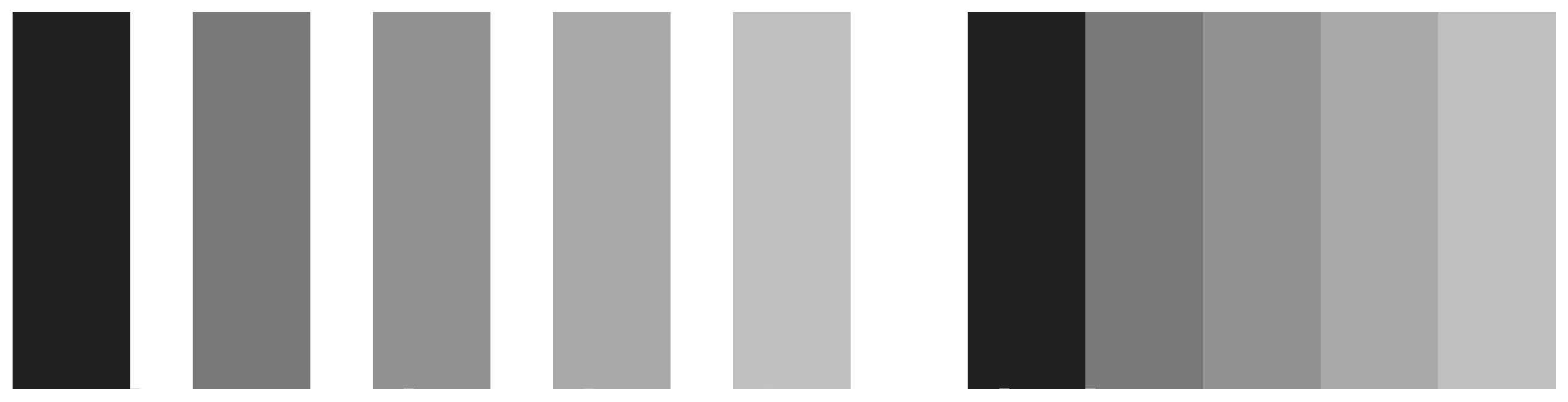
Contrast
The effect of contrast is distortion of the appearance of a patch of color in a way that increases the difference between a color and its surroundings.
We talk about luminance contrast when it occurs on the black-white channel, and chromatic when it occurs on the other two channels


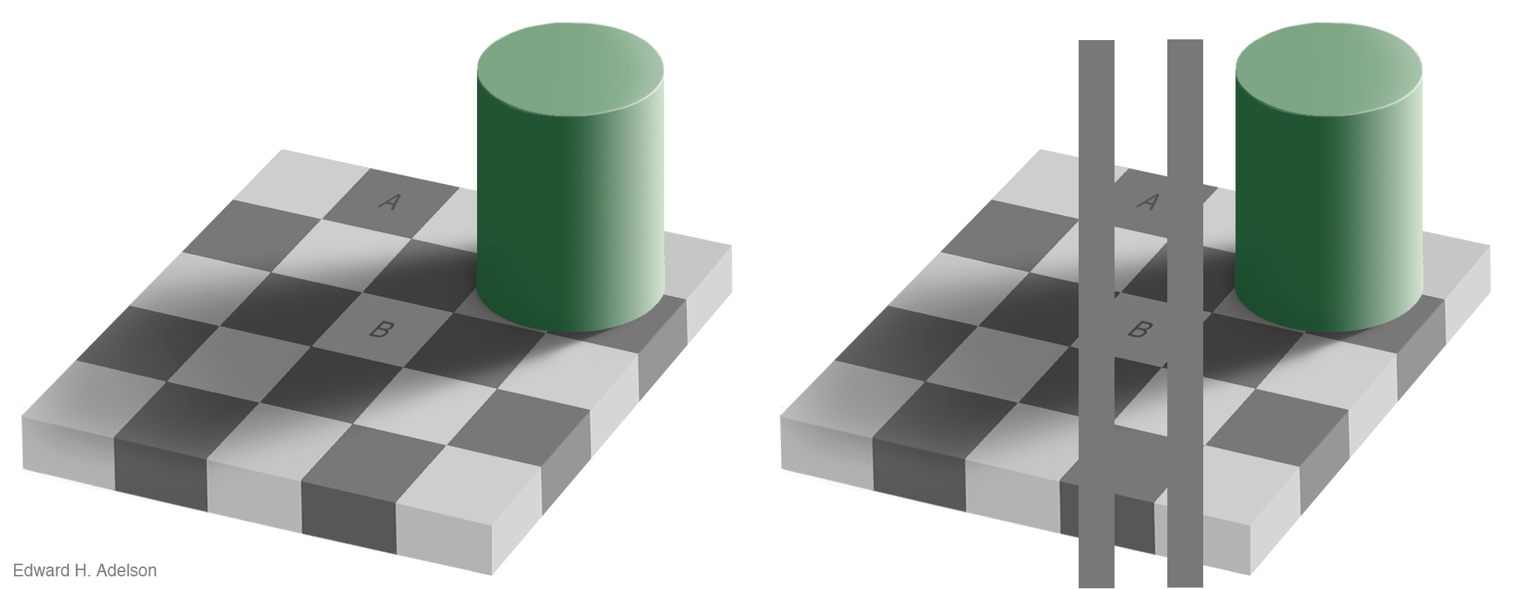
This phenomenon is called simultaneous contrast, where the background interpheres with our perception of a patch of color. It can create problems when reading values from a graphic.
Unique hues
When there is a strong positive or negative signal on one of the three channels, and a neutral one on the other two, we have “special” colors

In most languages, these six colors are identified as the basic ones [Brent Berlin and Paul Kay, 1969. Basic Color Terms: Their Universality and Evolution]
Saturation
Colors inducing a strong response on the chromatic channels are more “vivid”, and are said to be more saturated.

The maximum saturation for a given hue varies with luminance, because when colors are dark the difference between cone signals on chromatic channels is smaller.
Color segmentation

Remember the discriminability issue? Here is it at play!
Spatial detail
The luminance channel is more effective at conveying spatial details.

Recovering shapes from shades


We perceive three dimensional surfaces through changes of luminance, rather than through chromatic changes.
The RGB color space
\((red, green, blue)\)
In computer representations, each component goes from 0 to 255
Why red, green and blue? This is the set of colors with the widest gamut, that is the set of all colors that can be defined by means of combining the three primary colors.

( 235, 91, 52 ) xxxx #eb5b34
HCL color space

HCL - Hue
What we intuitively think of as pure colors

HCL - Chroma
The “colorfulness” or intensity of the color. From “vivid” to “muted”

HCL - Luminance
Intuitively, the brightness of the color, or the amount of black mixed into the color. From “dark” to “light”

Sequential mapping pitfalls:
Source: https://socviz.co/lookatdata.html#perception-and-data-visualization
Sequential mapping pitfalls:
Source: https://socviz.co/lookatdata.html#perception-and-data-visualization
Encoding with color, a summary

Encoding with color, a summary

Encoding with color, a summary

Encoding with color, a summary

Encoding with color, a summary

Encoding with color, a summary

Encoding with color, a summary

Categorical color maps - a bad example

Source: Munzner, ch.10, fig 10.8.
Ordered colormaps: sequential

Ordered colormaps: diverging

The rainbow color map
It’s often used to encode ordered data, why is it confusing?

The rainbow color map


The rainbow color map

The rainbow color map


The specplot
The wizard shows, among other things, the specplot which reports how the HCL values change in the palette


The contrast ratio
The contrast ratio, as defined by the World Wide Web Consortium, is a number quantifying the contrast with the background. It should be higher than 4 for text, as a general guideline


Bivariate color palettes
Can be used to encode two different variables with color: use with extreme care!
pal1 <- tibble(c1 = c("#f5f5f5","#EE744B","#9F1401"),
               dim1 = c("low", "mid", "high"))
pal2 <- tibble(c2 = c("#f5f5f5","#878FD3","#07489C"),
               dim2 = c("low", "mid", "high"))
crossing(pal1, pal2) %>%
  mutate(
    color = hex(mixcolor(0.5, hex2RGB(c1), hex2RGB(c2))),
    across(starts_with("dim"), ~ factor(.x,
                                        levels = c("low", "mid", "high"),
                                        ordered=T))
  ) %>%
  ggplot(aes(x=dim1, y=dim2, fill=color)) +
  geom_tile() +
  scale_fill_identity() +
  theme_classic() +
  theme(axis.line = element_blank())

Source: Timo Grossenbacher
Case study

Solution
