
When writing conference articles we have to work with very strict page limits: not a single line is allowed beyond the prescribed 12 pages (or 10 or whatever…).
I think that adding figures is a good way of showing your results, but oftentimes plots containing lots of colored lines require a large legend to be interpretable. Large legends take up a lot of space.
Instead of fiddling with the positioning of the legend, a possibility is to remove the legend altogether from the plot. But then how are readers supposed to get information out of your plot? Simple: use the same colors to underline relevant parts of the caption.
This can be rather easily implemented in \(\LaTeX\) by using the ulem and contour packages, extending a trick I learned here.
To make the thick colored underline work nicely with descenders we can use the contour package to draw a white “aura” around each underlined word.
In the preamble of your document add the following:
\usepackage{contour}
% Load `ulem` with the `normalem` option so to not
% mess with the `\emph` command
\usepackage[normalem]{ulem}

% These two lines control the thickness of the underline,
% and its distance from the baseline of the words.
\renewcommand{\ULthickness}{0.4ex}
\renewcommand{\ULdepth}{0.7ex}

% This line controls the "width" of the white
% contour around each word.
\contourlength{0.2ex}

% Finally this is the command for UnderLine Colors.
% It takes two arguments: the first is the text to underline
% the second is the color to use.
\newcommand{\ulc}[2]{%
  {\color{#2}\uline{\phantom{#1}}}%
  \llap{\contour{white}{#1}}%
}
The missing piece is now a color palette in \(\LaTeX\) matching the one used in the plot. To this end we can use the ability of the xcolor package to define colors using hex code:
\definecolor{color name}{HTML}{color hex}If you generate your figures with Python, then you can create a palette.tex file with the following snippet (assuming you are using the tab10 palette)
from matplotlib import pyplot as plt
from matplotlib.colors import to_hex

colors = plt.colormaps["tab10"].colors
with open("palette.tex", "w") as fp:
    for i in range(len(colors)):
        col = to_hex(colors[i]).replace("#", "")
        print("\\definecolor{color%d}{HTML}{%s}" % (i, col), file=fp)
The outcome is a palette.tex file that you can include in your \(\LaTeX\) preamble which looks like the following
\definecolor{color0}{HTML}{1f77b4}
\definecolor{color1}{HTML}{ff7f0e}
\definecolor{color2}{HTML}{2ca02c}
\definecolor{color3}{HTML}{d62728}
\definecolor{color4}{HTML}{9467bd}
\definecolor{color5}{HTML}{8c564b}
\definecolor{color6}{HTML}{e377c2}
\definecolor{color7}{HTML}{7f7f7f}
\definecolor{color8}{HTML}{bcbd22}
\definecolor{color9}{HTML}{17becf}
Finally, you can use the \ulc command as follows
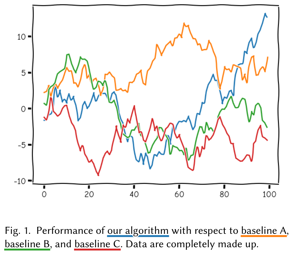
\begin{figure}
    \includegraphics[width=\columnwidth]{plot.png}
    % Note that we have to explicitly set the optional short
    % caption to something that does not use the underlines, otheriwse
    % the code does not compile.
    \caption[]{Performance of
        \ulc{our algorithm}{color0}
        with respect to
        \ulc{baseline A}{color1},
        \ulc{baseline B}{color2},
        and \ulc{baseline C}{color3}.
        Data are completely made up.
    }
\end{figure}